

What is Color Theory? It’s a collection of rules and guidelines which designers use to communicate with users by creating appealing color schemes in visual interfaces. To make sure they are choosing the best colors possible, designers will use a color wheel and other collected knowledge we know about human optical ability, psychology, and culture. The color wheel was invented in 1666 by Sir Isaac Newton. He defined color into three groups, Primary (red, blue, yellow), Secondary (mixes of primary colors), and Tertiary (Mixes of primary and secondary colors). Objects reflect light in different combinations of wavelengths and our brains pick up on those combinations and translate them into what we call color.
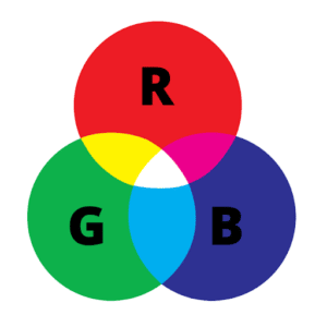
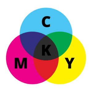
However, colors can look different to our eyes if they’re on a screen or printed out on paper. Screens use red, green, and blue as their primary colors and mix them to create other colors. Let’s say you have a distinct brand with a bright yellow logo. When you go to post that logo on a social media platform or maybe a website but you don’t use the correct color process, your logo will look muddy and dull compared to that bright yellow. Whenever you’re working with files that are meant to be displayed on screens, you always use RBG and not CMYK.
What about Color Schemes?
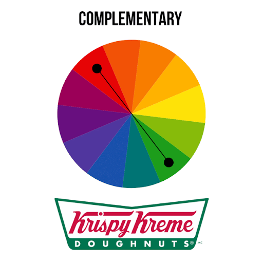
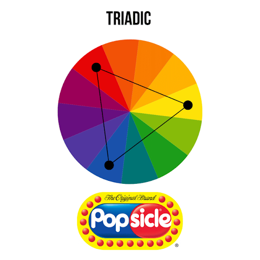
Using the color wheel, a designer can develop a color scheme for marketing materials. We break these down into complementary, analogous, and triadic.
Complementary Colors
Complementary colors are two colors that are on opposite ends of a color wheel. Using Complementary colors is an excellent way to make certain images very vibrant and visible. You need to be careful not to overuse them, however. Think red and green, they offset each other well, but overusing them could cause people to think of Christmas.
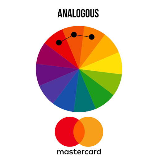
Analogous Colors
Analogous colors are colors that are right next to each other on the color wheel. For example, red, orange, and yellow. In this scheme, one color will dominate, one will support, and the other will accent. In business, analogous colors are not only pleasing to the eye but can effectively instruct the consumer where and how to take action.
Triadic Colors
Triadic colors are evenly spaced around the color wheel and tend to be bright and dynamic. This scheme also creates visual contrast while at the same time harmony.
You can dive deeper into color theory with UX design (the process of defining the experience a user would go through when interacting with a digital product or website) as well. The right contrast is vital to catching users’ attention in the first place. The vibrancy you choose is very important in provoking the desired emotional responses.
For example, Blue- an industry standard for banking in the West- also has positive associations with other cultures. However, some colors can evoke contradictory feelings. Red is seen as good fortune in China, mourning in South Africa, and danger or attention in the US.
Just like fashion, color schemes can be trendy, with new schemes popping up every season. Designers should consider this by thinking: will it date the brand in a year? Meaning, will this color scheme make the brand seem out of touch and not with the times. Understanding the theory behind the color can do wonders for how you actually use them.