
Buttons, an element we use almost every day, often goes unnoticed as their usage is almost second nature.
They are, however, vital in creating positive and productive user experiences. In the Spruced App, an app that connects local professionals with clients, I aimed to create buttons that grabbed the user’s attention and allowed for a simple and intuitive user journey.
How Can You Use Them?
For a button to be successful, it must be easily identifiable, while clearly indicating the action a user can complete. For the Spruced App, our goal was to facilitate the process of booking services via a mobile app. In doing so, it’s important to have buttons to help guide that process. My first goal in achieving this was to make buttons that look like buttons. Users need to know instantly what is clickable, or in this case ‘tappable’, and what isn’t. I decided to use familiar designs such as rounded corners and maintained that design throughout the entirety of the app. Consistency improves speed and accuracy, and that is what’s needed to keep the user engaged and ensure the completion of the desired task.
“Consistency is one of the most powerful usability principles: when things always behave the same, users don’t have to worry about what will happen.” — Jakob Nielsen
Here\’s Some Examples
In this example, I went with a rounded, wide button. Rounded corners are said to be modern, simple, and easier on the eyes, allowing for a more pleasant experience.
While wide buttons are easier to spot, and more importantly, easier to tap. Properly sizing your buttons and making them finger-friendly are important when designing for apps. You want to ensure that your user has no mishaps and uncertainty when called to action.
In addition to that, designing a button with a contrasting color to the surrounding elements is also vital. I chose a darker green because it’s much easier to see and stands out against the background.


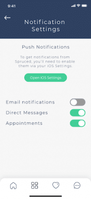
For here, I chose a toggle button. Toggle buttons are useful when the user is expected to turn a feature on or off.
Different colors represent the current state of the button. A grey color often is representative of a button that is disabled or turned ‘off’. I kept with the green coloring of the previous buttons to determine an active or ‘on’ state.
Differentiating between different states is very important in creating clarity with the user.
As you can see, buttons are extremely pertinent to the success of a user journey. Without them, you will not be able to make choices or complete actions. Try to aim for a button that is familiar, properly sized, and consistent with the overall aesthetic of your design.
Ready to push some buttons together?
Procept Marketing specializes in progressive web applications & App development. Let\’s chat!
Click Here